This page covers configuration shared by both installation modes.
Icons configuration
Trident UI lets you load icon groups through providers.
Install the icons package first:
For the full icon catalog and usage examples, see the @clubmed/trident-icons Storybook.
For AI-assisted icon integration guidance, see the AI integration note.
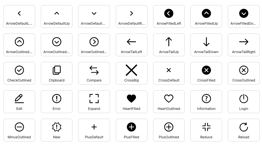
Preview of Trident UI icon sets.
Available providers:
SvgIconProvider: lazy-loaded SVG rendering.SvgUseIconProvider: nativesvg/userendering.
Available icon groups:
Fill · Fill EC · Outline · Outline EC
By default, no icon provider is set. Import and register only the subsets you need.
SVG mode:
import Actions from '@clubmed/trident-icons/svg/Actions'
import { Icon, IconsProvider } from '@clubmed/trident-icons'
function App() {
return (
<IconsProvider icons={[Actions]}>
<Icon name="ArrowDefaultLeft" />
</IconsProvider>
)
}You can mix SVG and SVG-use modes:
import Actions from '@clubmed/trident-icons/svg/Actions'
import Brand from '@clubmed/trident-icons/svg/Brand'
import { Icon, IconsProvider } from '@clubmed/trident-icons'
function App() {
return (
<IconsProvider icons={[Actions, Brand]}>
<Icon name="ArrowDefaultLeft" />
<Icon name="ClubMed" />
</IconsProvider>
)
}In this setup, Icon automatically uses the correct resolver.
Register custom icons
You can register external SVG icons without building a custom icon component:
import { lazy } from 'react'
import { resolver } from '@/atoms/Icons/svg/SvgIconResolver'
import { Icon, IconsProvider } from '@clubmed/trident-icons'
const CustomIcons = resolver([
{
name: 'MyCustomIcon',
group: 'custom',
element: lazy(() => import('./MyCustomIcon.svg?react')),
// viewBox: '0 0 30 30',
// aspectRatio: 1,
// orientation: 'left'
},
])
function App() {
return (
<IconsProvider icons={[CustomIcons]}>
<Icon name="MyCustomIcon" />
</IconsProvider>
)
}Optional: twMerge helper
If you use tailwind-merge, prefer the helper exported by Trident UI:
import { twMerge } from '@clubmed/trident-ui/helpers/twMerge'